7 Agile Charts and Visual Tools To Track Your Progress
 (1)")
No one builds the perfect agile work environment overnight. However, if you’re not using the right agile charts and metrics, you may not even realize there’s room for improvement.
Charts are essential tools in agile project management as they give teams quick visual references for judging progress, identifying bottlenecks, and making informed decisions.
This guide will introduce you to some of the best and most popular agile charts available, with examples, explanations, and tips for success. This way, your team can learn from their mistakes and come out the other side stronger for it.
Burndown charts
A Burndown chart tracks how much work remains (measured in tasks or story points) over a given time. This agile chart will help you track team progress on a sprint and alert you if your team is falling behind on its sprint backlog.
Benefits of Burndown charts
Burndown charts are especially good for teams engaged in sprints or project work as they give everyone a clear idea of how far they’ve come and how much more is left to do.
Product managers and stakeholders will also find these useful as they help teams identify trends, deviations, and potential issues early on. Using a Burndown chart, teams can figure out whether they’re falling behind and make course corrections right away.
How to create a Burndown chart
A Burndown chart consists of an x-axis that tracks time and a y-axis that tracks work completion according to a metric like story points completed or tasks completed.
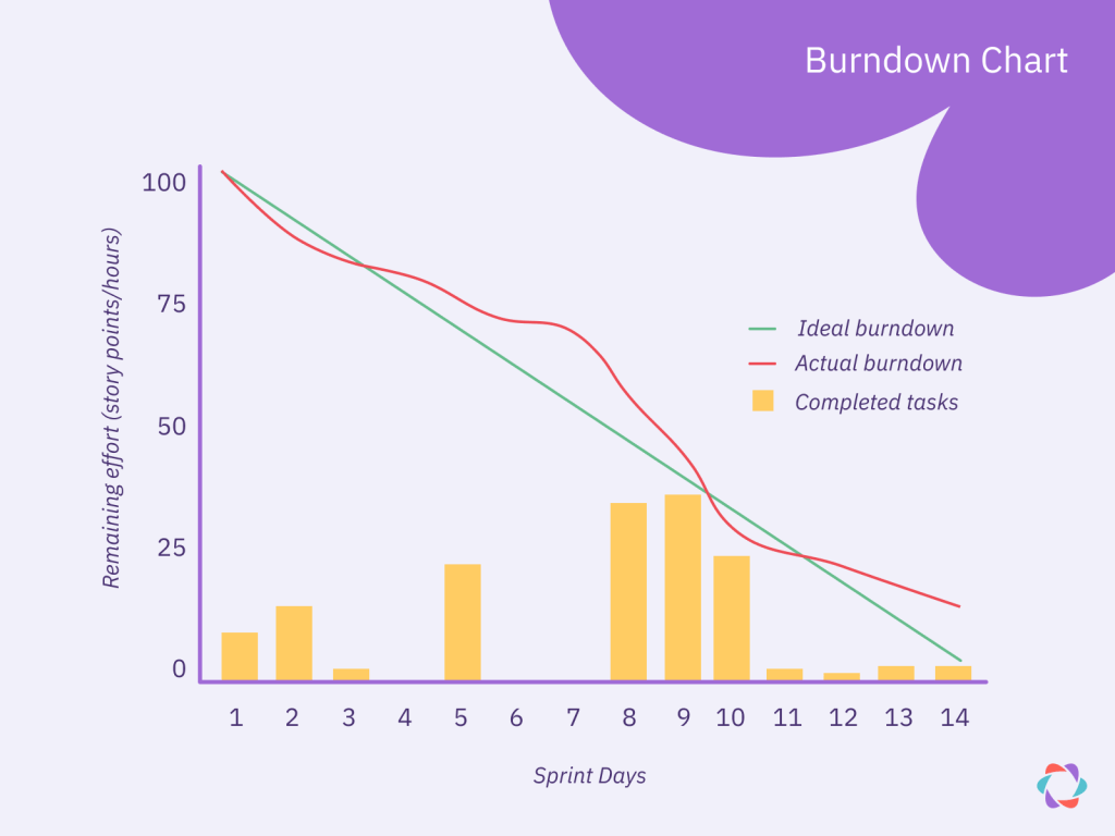
The straight line drawn from the top of the y-axis to the far right of the x-axis marks the ideal burndown. If your team’s actual burndown line is above the ideal burndown line, then they are behind schedule and should look to understand why.
Follow these steps to create your first Burndown chart:
- Outline scope: Define which issues will be worked on during this project or sprint.
- Estimate work: Assign estimates (e.g., story points) to each task or user story.
- Set timeframes: Establish how long the sprint or project will take.
- Define the x-axis: Decide how you will measure work done (e.g., percentage completed, tasks completed, story points) and fill in the x-axis so the remaining project work starts at the top and makes its way down to completion.
- Plot the y-axis: These will be increments of time starting at 0 and ending at the estimated completion date.
- Mark ideal burndown: Draw a straight line from the top of the x-axis to the far right of the y-axis.
- Graph the data: Plot the remaining work on the chart against the corresponding days, creating a line that trends down toward zero by the end of the timeframe.
Burndown charts can measure progress at different scales, running from measuring sprints to product releases, which you’ll see in the examples below.
Burnup charts
Burnup charts are similar to Burndown charts but with one key difference – they measure work completed, not work remaining. This difference makes Burnup charts ideal for monitoring how much you can expect your team to finish per day and keeping track of scope creep.
Benefits of Burnup charts
One of the biggest flaws of a Burndown chart is that it cannot account for scope creep since it only measures work remaining from your initial planning. If your team finishes 10 story points while at the same time your project expands by 10 story points, then it’ll look like they haven’t accomplished anything.
In a Burnup chart, you include a line measuring the size of your sprint backlog, which can be adjusted if additional work is added mid-sprint. This means you can keep an eye on scope creep and have a more accurate understanding of your team’s efficiency as well.
How to create a Burnup chart
Create a Burnup chart by following our guide above on creating a Burndown chart with the following differences.
- Adjust your y-axis so that it measures total story points, tasks completed, etc.
- Start your expected burnup line and actual burnup line from the bottom of the y-axis (0% completed).
- Add a third line that tracks your sprint goal measured in story points and adjust it accordingly based on scope creep.
Take a look at our example below to get a better idea of what a Burnup chart should look like.
Burnup chart Scrum example
This Burnup chart example illustrates how a team performed during this particular sprint. As you can see, the team started with a sprint goal of completing roughly 85 story points, which increased to 90 story points on day 11 of the Sprint.
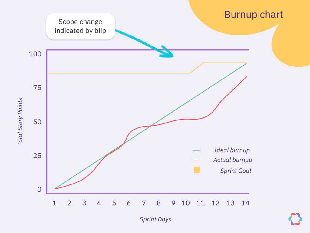
In a corresponding Burndown chart of this scenario, a major slowdown appears around day 11 as the amount of work increases due to scope creep. By looking at this Burnup chart, it becomes clear that although a slowdown occurs, it’s part of a larger trend that starts around day 7.
Product managers can look further into why that slowdown occurred and decide how best to handle it. In some situations, it may just be the result of people taking time off or events outside of the team’s control.
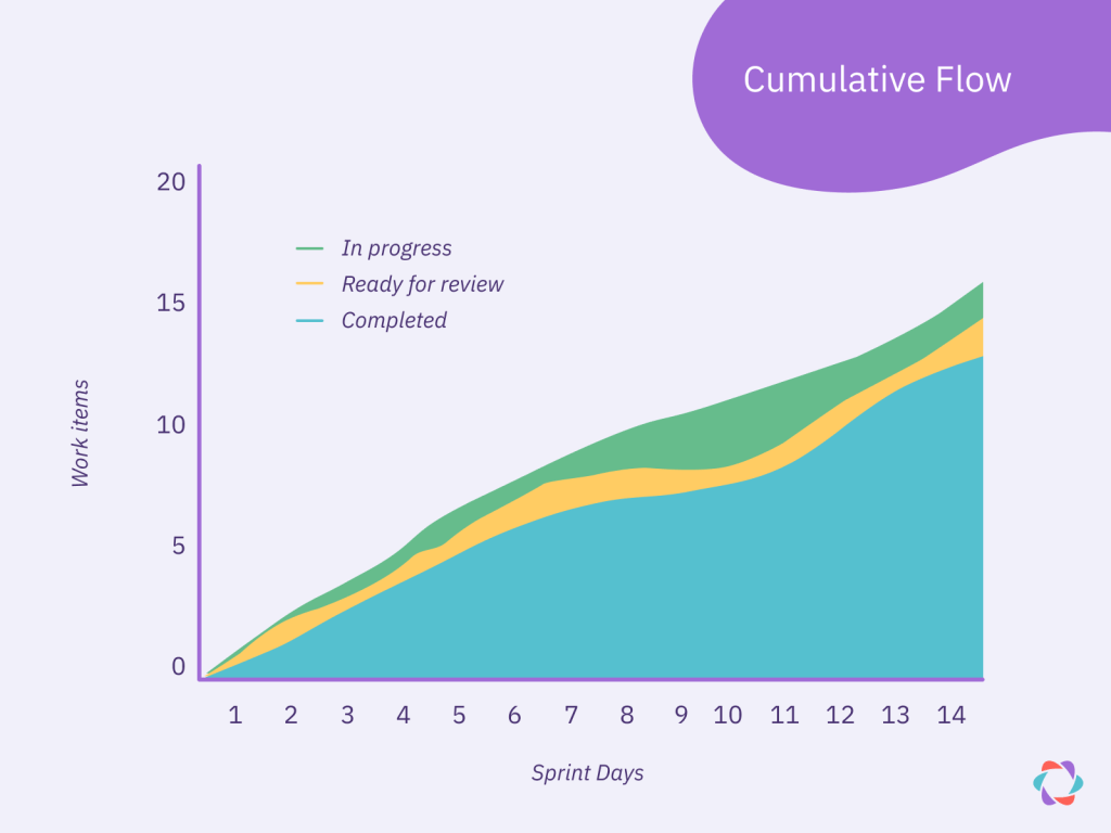
Cumulative flow diagrams
Cumulative flow diagrams show how work items move through various stages of development, helping teams identify bottlenecks and measure their overall workflow efficiency.
Maintaining cumulative flow diagrams benefits both teams and the broader organization, making them essential tools for optimizing processes and enhancing productivity.
Benefits of cumulative flow diagrams
Cumulative flow diagrams are important for all teams but are especially useful when projects rely on multiple stakeholders.
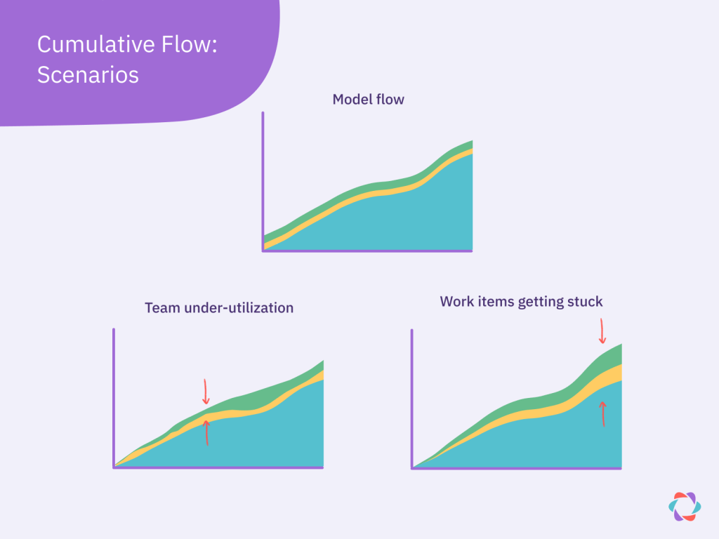
As these diagrams show the flow of work across stages or teams, it becomes possible for you to see where items get stuck or when teams are underutilized.
When looking at a cumulative flow diagram, you’ll see work items measured on the y-axis and time on the x-axis.
Each colored band represents a work stage, and ideally, you want tasks to flow smoothly from one phase to the next, with new tasks entering the graph at regular intervals. When this happens, you get a beautiful ideal flow with relatively parallel lines (see “Model flow” in the example above).
However, as this is the real world, your bands will likely be more irregular, with expansions and contractions throughout.
Expansion between bands means that work is getting stuck in that process as new work piles in and old work overstays its welcome. In contrast, contraction means that teams are finishing work before new tasks arrive – this may lead to team members having nothing to do. Both represent areas for further work optimization.
Cumulative flow diagram example
The example below shows how a cumulative flow diagram can help Scrum teams understand the results of their latest sprints, which can come in handy during retrospectives.
In this case, the team measures work items (y-axis) finished over time (x-axis). Each item passes through three stages: In progress (green), Ready for review (yellow), and Completed (blue).
With this setup, Scrum Masters see when inefficiencies arise during a sprint. For example, this graph tells us that on days 1 and 2, there aren’t enough tasks in progress, causing a potential glut later on. Team members could investigate why this occurred to see if they can improve for the next sprint so those lines look more even next time.
Velocity charts in agile
Velocity charts in agile methodologies track a team’s historical performance by measuring the amount of work (usually in story points) completed in each sprint. They provide insights into the team’s capacity and help forecast future work.
Benefits of a velocity chart
Beyond forecasting and capacity, velocity charts are also good for identifying how changes to your team affect efficiency. If you add a new team member or implement a new practice and see a corresponding sustained jump in velocity, you can take that as evidence of improvement.
Tracking this data over time allows you to see if your chosen agile frameworks, methodologies, and practices result in better outcomes.
Sprint velocity chart example
For sprint velocity charts, you’ll have a y-axis measuring story points (or other records of progress) and an x-axis representing different sprints.
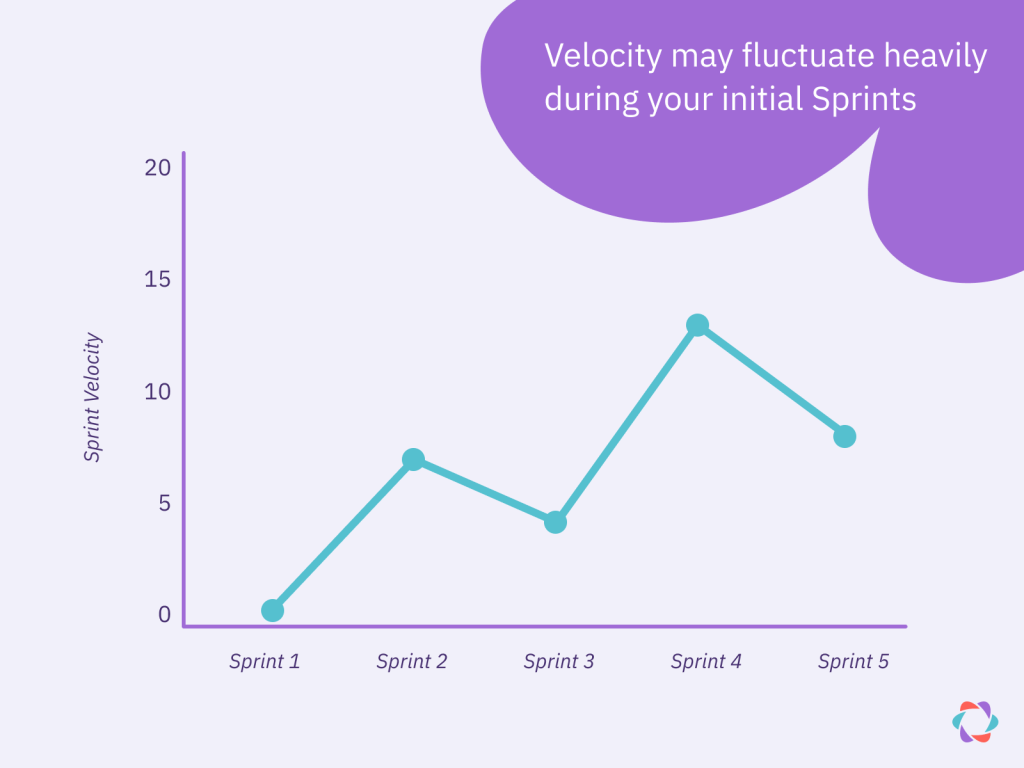
For each sprint, you’ll include the number of story points committed and the number of story points completed. Calculate your team’s velocity by averaging the total number of completed story points across each sprint.
In the above example, the velocity for this grouping of sprints is ___ story points (show math). Learn more about this in our guide to measuring velocity in Agile.
Other visual tools for agile teams
Although the agile charts above all play crucial roles in measuring different agile metrics, they’re not the only visual tools available to your team. Here is a quick rundown of other agile tools worth investigating.
Story Mapping
Story Mapping involves visually arranging user stories or product backlog items into a structured, top-down hierarchy to represent a new feature or product you are releasing.
This technique helps teams and stakeholders understand their product’s scope so they can prioritize work effectively. It also gives everyone a clear overview of a product so they can see what else needs to be added or removed for the best overall finished product.
Control charts
A control chart is a tool used to monitor the stability and variation in a process over time. Agile teams can use these charts to get a better understanding of how quickly they address and fix issues in their backlog.
Control charts also help teams understand when a particular issue is out of control. If your team’s average lead time is five days and an issue isn’t resolved in 10 days, that problem may need extra resources to get settled.
Kanban boards
Kanban boards visualize tasks as they move through a team or department. They help teams by making sure everyone knows what is happening and who is currently working on that task.
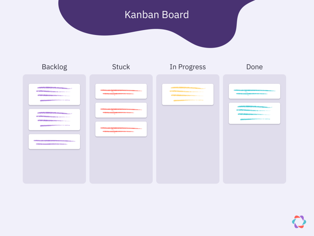
For remote teams especially, Kanban boards can become the single source of truth among a department, housing all of the information a team member needs to execute tasks throughout their day.
Track the agile metrics that matter most
Agile charts are only helpful when they visualize data that matters to you and your team. However, determining what you need to track isn’t always straightforward.
Track too much, and you’ll find you’re spending too much time on charts that no one is looking at. Track too little, and you might miss out on the insights you need.
The best way to figure out what metrics to follow is to rely on experience. We asked 38 agile experts what metrics they find helpful and released the results in this guide to the most popular agile metrics. Inside, you’ll find a list of the 10 most important agile metrics ranked by experts, with insights on why they were chosen so you can figure out which metrics might work best for your team.

Joshua Chapman
Josh Chapman is a content manager and SEO specialist at Animalz. When he isn’t creating content, he is busy travelling the world and reading a good book.