#478 – Vibe UI
Friday Ship #478 | February 13th, 2026

How about the state of AI?
Domo Arigato, Mr. Roboto
This week we had conversations as a team about the state of AI and tech.
Is the cup half empty, or half full, or overflowing? On the one hand, I think we’re getting tired of the slop, we wonder if the data centers will all but drain the power grid, and once we’re out of a job who’s gonna buy the toilet paper?
But then there’s the promise. How might AI be used as a tool to learn faster? To be more productive? To make better sense of large amounts of data and complexity in our companies and in our world?
Prototyping in short order
In this post I’m going to tip the scale toward the good parts. One recurring tradeoff for me is how much time to spend prototyping a design versus moving on to other work? That’s where Figma Make comes in. Make lets you turn a design into a sandboxed app quickly, and it’s a lot of fun. I’ll end my commercial now.
Here was my workflow and how I would do it differently moving forward.
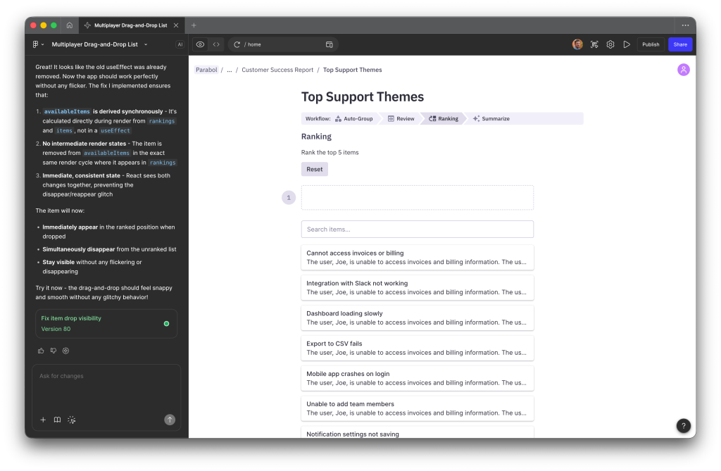
My workflow
I started with a few iterations of a ranking UI. The goal was to get to a core experience that could stand on its own or be embedded as an activity block on a page in Parabol.
I had some ideas in mind, which gave me a start. I was able to iterate once I saw how the interactions felt. I went back and forth with the editor.
I also wanted it to be multiplayer and testable with friends. I set up a Supabase project and was off to the races. Along the way it felt pretty clunky, and I had trouble prompting the AI agent to make it snappier and optimistic. It’s still kinda stuck there. Not sure how to unblock the agent at this point.
Some learnings
In the end I had the agent retroactively generate a Markdown file with requirements so I could rebuild it from scratch. My next steps are to build it in an environment I control. I want to make the codebase more maintainable, maybe even usable as a beta MVP.
I think the agent would get to a better result if I were more specific up front. Perhaps some coding guidelines would help the quality from the start, like feeling snappy etc. However, this approach allowed me to arrive to choices I hadn’t made with the original designs. It feels good to use trial and error with real interactions instead of static concepts.
Try it out
In this case it was a win as the prototype informed the core experience. I’d be comfortable using this UX in our production software. Here’s the prototype if you want to poke around.
Disclaimer: No LLM-generated text was used in this highlight. However, that lead image is another story (thanks Gemini). These are field notes written by me. Take care!
Metrics
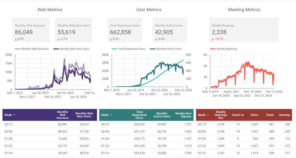
We had a nice uptick in monthly web sessions. While more people are landing on the site, a smaller percentage of them are crossing the finish line to create an account right now so that is something we will continue to watch.
This week we…
…wrapped up Cycle 12.
…release v12.0.2, v12.1, v12.2, and v12.2.1 were deployed to production.
Next week we’ll
…host a pre-mortem for a company-wide hack week.
